
Dragon Fruit
May 26, 2016 § Leave a comment
 I discovered dragon fruit at a co-op some years ago and was taken by their exotic colors, tail like growth, and their resemblance to fish. I decided to depict them in a pastel swirling through space with their tails flowing after.
Persephone in the Eaves
April 10, 2016 § Leave a comment
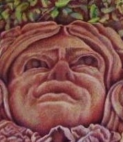
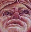
Serial imagery can be created by depicting your subject withing its setting, stepping in more closely, and finally even more to examine its finer details.
Using Multi Media
January 30, 2016 § Leave a comment
This is a colored pencil piece with pastel and Conte’ crayon. I would like to recommend the products used in this drawing. First, the use of colored paper; Canson, Arches, Strathmore, Rives all come in large sheets (usually 22″x30″, Canson usually runs smaller. By using colored paper, you change the equation of the value spectrum. Now you need to determine where on a scale of black to white this color fits. The white of the page will also need to be created. Therefore, keep in mind to save the value of the paper and create the white areas. Canson paper was used for this piece. A variety of colored pencil, mostly Derwent as well as Conte pastel pencil also comprised the media. For the highlights, white and pale yellow Conte crayon became indispensable. When using colored pencil, I would advise using the pastels sparingly and only to stretch the existing colors. I cannot over stress the aid of using a kneaded eraser. One can squeeze it into very fine shapes to erase tiny areas as well as being able to mold it into any shape you please. It leaves no oil residue on the page. And most importantly, you can bounce it off of walls when frustrated!!
http://amzn.to/2001iXP  http://amzn.to/1VxTPxX
  http://amzn.to/2006b36
  http://amzn.to/1VxWasO
  http://amzn.to/1PM897S
Joe and Frankie
November 5, 2015 § Leave a comment
One last view of the drawing of Joe and his Boston Terrier, Frankie as a pup. I’ve been working on revisions and at some point I have to say I’m done!!

Final Version of the Drawing of Joe and Frankie
October 22, 2015 § Leave a comment

Nearing the final stages of the mixed media drawing of our grandson Joe and his Boston Terrier Frankie. I had originally thought it would be watercolor with colored pencil, however I found pastel provided the drama and abstractions where needed. The pose was a difficult one and I was very unsure of it. However, time and the light play over the subjects led to subtle nuances which added to the story line. Plus I enjoy this tender moment in Joe’s relationship with Frankie.
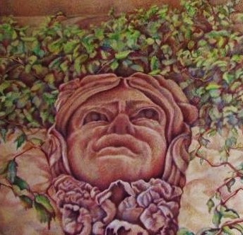
Lion of Pillsbury Hall
August 27, 2015 § Leave a comment
This is a great compelling snarling face from the walls of Pillsbury Hall on the University of Minnesota campus. It was completed in colored pencil and pastel on Canson paper.
r.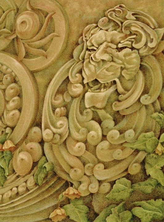
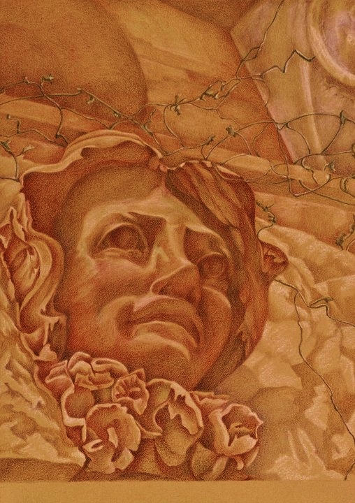
Looking up at Persephone
May 28, 2015 § Leave a comment
Another view of the sculpture of Persephone with the viewer below the doorway.
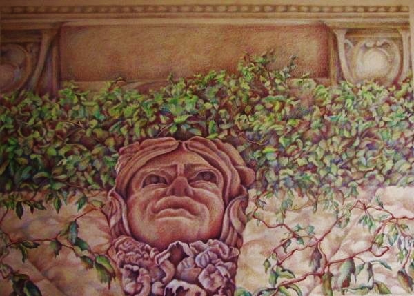
Persephone in Summer
April 19, 2015 § Leave a comment
 This wonderful sculpture over the doorway of McNeal Hall on the University of Minnesota campus always spoke to me as she hid under the vines of summer. She was part of a series based on the relationship of architectural sculpture to the building it inhabits and its meaning to the surrounding community.
Bling!
September 7, 2014 § Leave a comment
This pastel drawing highlights complementary colors revealed in the contrast of the icy blue colors of a necklace against the fiery hot yellow oranges of the background. The shapes of the jewelry wind in and out of the picture plane.
Using Watercolor to add Intensity to your Drawing
November 25, 2013 § Leave a comment
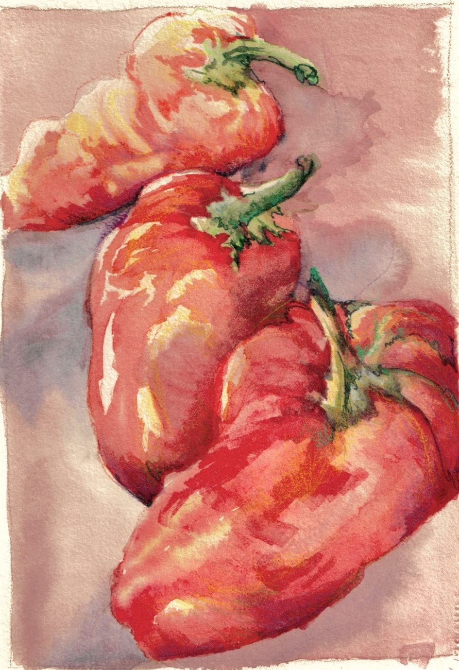
This is a piece depicting chili peppers used to demonstrate to my drawing students how watercolor can support drawing. I added pen and ink and pastel to refine the details and add intensity. I particularly enjoy the looseness of the wash with the clarity of the pen and pastel.
