
Dynamic Composition
June 25, 2015 § Leave a comment
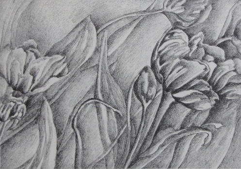
This pencil drawing illustrates the creation of balance on the page. The fan like light leaves spread out over the dark foliage of leaves and stems. The light value of the leaves connects with the space and shadows around the plant providing a strong pathway from objects nearest to us and those furthest away. The result is a dynamic composition filled with dramatic movement
.
Leaves in Space
January 28, 2015 § Leave a comment
 Another example of using the negative space to create a sense of balance with the positive. Here the leaves fill the lower left area giving it density, yet the introduction of only a minimal portion of the subject anchors the upper right and works with the space to create harmony in the composition moving the viewers eye up and off the page.
Creating a Sense of Harmony and Balance Between Figure and Ground
January 21, 2015 § Leave a comment
Continuing in the series based on two dimensional design concepts, we look at allowing the spatial areas of our compositions to step forward and claim power on the page. Too often, we tend to try and fill our artwork with subjects that are figural. In order to create a sense of harmony and balance, we need to allow the negative passages to hold as much power as the positive. Here we see the leaves and berries enter the composition from the edges. They reach out to activate the surrounding space. Notice how important the small passages involving the interplay of space and form become.
Which is Leaf and Which is Space?
January 7, 2015 § Leave a comment
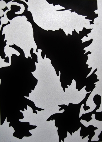
Here is where I eat crow!!!! In years past I would give my 2D students an assignment where they create as much form in the positive space as the negative. This effect is enhanced by using black and white. Most of us can relate to this by remembering the face vase picture. A vase in the center is framed by faces on either side. Sometimes when we look at it we see the vase as form and the faces as space. Other times we see the faces and the vase becomes spatial. Finally I had to complete such a picture for The Little Book of Drawing and I can tell you it was darn hard!!! It is much easier to instruct someone how to do something than to do it yourself; thus the eating of crow!!!! In this composition, which is an extension of using the leaf form in more complex pieces, we see as much form in the black forms as the white. Other terms for form and space or positive and negative are figure and ground. Which are the leaves and which define the space? It is a tricky thing to accomplish as you need to create absolute equality between positive and negative aspects.
Bling!
September 7, 2014 § Leave a comment
This pastel drawing highlights complementary colors revealed in the contrast of the icy blue colors of a necklace against the fiery hot yellow oranges of the background. The shapes of the jewelry wind in and out of the picture plane.
Watercolor as a Drawing Medium
November 25, 2013 § 1 Comment

I am returning to watercolor after many years to explore its use with colored pencil and ink. So far, I am very excited as it has lent a vibrancy to my work that was lacking. This is a piece completed some years ago. If anyone has any tips of their own, please feel free to share!!
Letting the Contour do the Work for You!!!
September 19, 2013 § Leave a comment

Here is the contour and finished gradation of a floral. Notice how the line drawing does most of the work for you. It reveals the light source, which comes from the right. It tells a story of flowers nestling into their stems as they bend and reach upward. The composition gives a great sense of rhythm and repetition and shows an area of focus which is the flower on the right. Most importantly, it lets your personality shine through. The gradation should not require as much effort as the preplanning, expression, and the hard work have already been done!
Using the Space Around the Subject
September 17, 2013 § Leave a comment

Here the forms are generally dark in value and the space around them are light, providing a stark contrast. There is also a give and take between the light palm leaves and the dark; creating a sense of interplay and a link with the frontal shapes and the ground. Think of the subjects as figures and the space as ground. Take the time to examine how you can activate portions of the composition usually not thought about by allowing the plants to break out of the borders, create dynamic movement, and instill interesting connections within those areas. Allow a real give and take between the positive figures and the negative space.
